
Konfigurasi Default Option

Get started with over a dozen reusable components with enhancement styles and additional components and options. Built in Components Built-in Components in the SimBox UI theme are actually HTML components or elements that have their styling and class …
Konfigurasi Default Option

Get started with over a dozen reusable components with enhancement styles and additional components and options.
Built in Components
Built-in Components in the SimBox UI theme are actually HTML components or elements that have their styling and class names set so they can be reused.
Accordion/Collapsible
The accordion component is a collection of vertically collapsing header and body elements that can be used to show and hide information.
A popular use case would be the "Frequently Asked Questions" section of a website or page when you can show questions and answers for each child element.
Nesting Accordion/Collapsible
Accordion or Collapsible Panels can be nested. All of the mentioned options are supported.
Lorem ipsum dolor sit amet, consectetur adipisicing elit, sed do eiusmod tempor incididunt ut labore et dolore magna aliqua. Ut enim ad minim veniam, quis nostrud exercitation ullamco laboris nisi ut aliquip ex ea commodo consequat.
Lorem ipsum dolor sit amet, consectetur adipisicing elit, sed do eiusmod tempor incididunt ut labore et dolore magna aliqua. Ut enim ad minim veniam, quis nostrud exercitation ullamco laboris nisi ut aliquip ex ea commodo consequat.
Lorem ipsum dolor sit amet, consectetur adipisicing elit, sed do eiusmod tempor incididunt ut labore et dolore magna aliqua. Ut enim ad minim veniam, quis nostrud exercitation ullamco laboris nisi ut aliquip ex ea commodo consequat.
Lorem ipsum dolor sit amet, consectetur adipisicing elit, sed do eiusmod tempor incididunt ut labore et dolore magna aliqua. Ut enim ad minim veniam, quis nostrud exercitation ullamco laboris nisi ut aliquip ex ea commodo consequat.
Lorem ipsum dolor sit amet, consectetur adipisicing elit, sed do eiusmod tempor incididunt ut labore et dolore magna aliqua. Ut enim ad minim veniam, quis nostrud exercitation ullamco laboris nisi ut aliquip ex ea commodo consequat.
Lorem ipsum dolor sit amet, consectetur adipisicing elit, sed do eiusmod tempor incididunt ut labore et dolore magna aliqua. Ut enim ad minim veniam, quis nostrud exercitation ullamco laboris nisi ut aliquip ex ea commodo consequat.
<div class="elcreative_accordion">
    <div class="accordion_panel">
        <button class="accordion_button" type="button" data-toggle-class="active" data-toggle-target-next=""><strong>Collapse 1 - Click Me!</strong></button>
        <div class="accordion_content">
            <p>Lorem ipsum dolor sit amet, consectetur adipisicing elit, sed do eiusmod tempor incididunt ut labore et dolore magna aliqua. Ut enim ad minim veniam, quis nostrud exercitation ullamco laboris nisi ut aliquip ex ea commodo consequat.</p>
            <div class="elcreative_accordion">
                <div class="accordion_panel">
                    <button class="accordion_button" type="button" data-toggle-class="active" data-toggle-target-next=""><strong>Collapse 1 - Click Me!</strong></button>
                    <div class="accordion_content">
                        <p>Lorem ipsum dolor sit amet, consectetur adipisicing elit, sed do eiusmod tempor incididunt ut labore et dolore magna aliqua. Ut enim ad minim veniam, quis nostrud exercitation ullamco laboris nisi ut aliquip ex ea commodo consequat.</p>
                    </div>
                </div>
                <div class="accordion_panel">
                    <button class="accordion_button" type="button" data-toggle-class="active" data-toggle-target-next=""><strong>Collapse 2 - Click Me!</strong></button>
                    <div class="accordion_content">
                        <p>Lorem ipsum dolor sit amet, consectetur adipisicing elit, sed do eiusmod tempor incididunt ut labore et dolore magna aliqua. Ut enim ad minim veniam, quis nostrud exercitation ullamco laboris nisi ut aliquip ex ea commodo consequat.</p>
                    </div>
                </div>
                <div class="accordion_panel">
                    <button class="accordion_button" type="button" data-toggle-class="active" data-toggle-target-next=""><strong>Collapse 3 - Click Me!</strong></button>
                    <div class="accordion_content">
                        <p>Lorem ipsum dolor sit amet, consectetur adipisicing elit, sed do eiusmod tempor incididunt ut labore et dolore magna aliqua. Ut enim ad minim veniam, quis nostrud exercitation ullamco laboris nisi ut aliquip ex ea commodo consequat.</p>
                    </div>
                </div>
                <div class="accordion_panel">
                    <button class="accordion_button" type="button" data-toggle-class="active" data-toggle-target-next=""><strong>Collapse 4 - Click Me!</strong></button>
                    <div class="accordion_content">
                        <p>Lorem ipsum dolor sit amet, consectetur adipisicing elit, sed do eiusmod tempor incididunt ut labore et dolore magna aliqua. Ut enim ad minim veniam, quis nostrud exercitation ullamco laboris nisi ut aliquip ex ea commodo consequat.</p>
                    </div>
                </div>
            </div>
        </div>
    </div>
    <div class="accordion_panel">
        <button class="accordion_button" type="button" data-toggle-class="active" data-toggle-target-next=""><strong>Collapse 2 - Click Me!</strong></button>
        <div class="accordion_content">
            <p>Lorem ipsum dolor sit amet, consectetur adipisicing elit, sed do eiusmod tempor incididunt ut labore et dolore magna aliqua. Ut enim ad minim veniam, quis nostrud exercitation ullamco laboris nisi ut aliquip ex ea commodo consequat.</p>
        </div>
    </div>
</div>
Alerts
The alert component can be used to provide information to your users such as success or error messages, but also highlighted information complementing the normal flow of paragraphs and headers on a page.
We also includes dismissable alerts which can be hidden by the users by clicking on the close icon.
Default Alert
Use the following examples of alert components to show messages as feedback to your users.
Alert! Change a few things up and try submitting again.
Info alert! Change a few things up and try submitting again.
Success alert! Change a few things up and try submitting again.
Warning alert! Change a few things up and try submitting again.
Error alert! Change a few things up and try submitting again.
<div class="elcreative_alert">
    <p><strong>Alert!</strong> Change a few things up and try submitting again.</p>
</div>
<div class="elcreative_alert alert_info">
    <p><strong>Info alert!</strong> Change a few things up and try submitting again.</p>
</div>
<div class="elcreative_alert alert_success">
    <p><strong>Success alert!</strong> Change a few things up and try submitting again.</p>
</div>
<div class="elcreative_alert alert_warning">
    <p><strong>Warning alert!</strong> Change a few things up and try submitting again.</p>
</div>
<div class="elcreative_alert alert_error">
    <p>Error alert! Change a few things up and try submitting again.</p>
</div>
Outlined Alert
Use this example to add a border accent to the alert component instead of just a plain background.
Alert! Change a few things up and try submitting again.
Info alert! Change a few things up and try submitting again.
Success alert! Change a few things up and try submitting again.
Warning alert! Change a few things up and try submitting again.
Error alert! Change a few things up and try submitting again.
<div class="elcreative_alert alert_outline">
    <p><strong>Alert!</strong> Change a few things up and try submitting again.</p>
</div>
<div class="elcreative_alert alert_outline alert_info">
    <p><strong>Info alert!</strong> Change a few things up and try submitting again.</p>
</div>
<div class="elcreative_alert alert_outline alert_success">
    <p><strong>Success alert!</strong> Change a few things up and try submitting again.</p>
</div>
<div class="elcreative_alert alert_outline alert_warning">
    <p><strong>Warning alert!</strong> Change a few things up and try submitting again.</p>
</div>
<div class="elcreative_alert alert_outline alert_error">
    <p><strong>Error alert!</strong> Change a few things up and try submitting again.</p>
</div>
Alerts with Additional Content
Alerts can also contain additional HTML elements like headings, paragraphs, dividers, etc:
Ensure that these requirements are met:
- At least 10 characters (and up to 100 characters)
- At least one lowercase character
- Inclusion of at least one special character, e.g., ! @ # ?
Ensure that these requirements are met:
- At least 10 characters (and up to 100 characters)
- At least one lowercase character
- Inclusion of at least one special character, e.g., ! @ # ?
Well done!
Oh yeah, you successfully read this important alert message. This example text is going to run a bit longer so that you can see how spacing within an alert works with this kind of content.
Whenever you need to, be sure to use margin utilities to keep things nice and tidy.
Well done!
Oh yeah, you successfully read this important alert message. This example text is going to run a bit longer so that you can see how spacing within an alert works with this kind of content.
Whenever you need to, be sure to use margin utilities to keep things nice and tidy.
<div class="elcreative_alert alert_info">
    <p><strong>Ensure that these requirements are met:</strong></p>
    <ul>
        <li>At least 10 characters (and up to 100 characters)</li>
        <li>At least one lowercase character</li>
        <li>Inclusion of at least one special character, e.g., ! @ # ?</li>
    </ul>
</div>
<div class="elcreative_alert alert_outline alert_success">
    <p><strong>Ensure that these requirements are met:</strong></p>
    <ul>
        <li>At least 10 characters (and up to 100 characters)</li>
        <li>At least one lowercase character</li>
        <li>Inclusion of at least one special character, e.g., ! @ # ?</li>
    </ul>
</div>
<div class="elcreative_alert alert_warning">
    <p><strong>Well done!</strong></p>
    <p>Oh yeah, you successfully read this important alert message. This example text is going to run a bit longer so that you can see how spacing within an alert works with this kind of content.</p>
    <hr />
    <p>Whenever you need to, be sure to use margin utilities to keep things nice and tidy.</p>
</div>
<div class="elcreative_alert alert_outline alert_error">
    <p><strong>Well done!</strong></p>
    <p>Oh yeah, you successfully read this important alert message. This example text is going to run a bit longer so that you can see how spacing within an alert works with this kind of content.</p>
    <hr />
    <p>Whenever you need to, be sure to use margin utilities to keep things nice and tidy.</p>
</div>
Buttons
The button component is probably the most widely used element in any user interface or website as it can be used to launch an action but also to link to other pages.
We provides a large variety of styles and sizes for the button component including outlined buttons, multiple colors, sizes, buttons with icons, and more.
Default Button
Use these default button to indicate an action or link within your website.
Button Default Button Outlined Button Unelevated Button RaisedYou can add elcreative_button class to the element.
- Add
outlinedclass to the element if you want to make Outlined button style. - Add
unelevatedclass to the element if you want to make Unelevated button style. - Add
raisedclass to the element if you want to make Raised button style.
<a href="#" class="elcreative_button">Button Default</a>
<a href="#" class="elcreative_button outlined">Button Outlined</a>
<a href="#" class="elcreative_button unelevated">Button Unelevated</a>
<a href="#" class="elcreative_button raised">Button Raised</a>
Button Rounded
The button rounded can be used as an alternative style by using fully rounded edges.
Button Default Button Outlined Button Unelevated Button RaisedYou can add rounded class to the element.
<a href="#" class="elcreative_button rounded">Button Default</a>
<a href="#" class="elcreative_button rounded outlined">Button Outlined</a>
<a href="#" class="elcreative_button rounded unelevated">Button Unelevated</a>
<a href="#" class="elcreative_button rounded raised">Button Raised</a>
Button with Colors
Use these default button styles with multiple colors to indicate an action or link within your website.
Button Info Default Button Success Outlined Button Warning Unelevated Button Error Raised- Add
button_infoclass to the element if you want to make Info button style. - Add
button_successclass to the element if you want to make Success button style. - Add
button_warningclass to the element if you want to make Warning button style. - Add
button_errorclass to the element if you want to make Error button style.
<a href="#" class="elcreative_button button_info">Button Info Default</a>
<a href="#" class="elcreative_button button_success outlined">Button Info Outlined</a>
<a href="#" class="elcreative_button button_warning unelevated">Button Info Unelevated</a>
<a href="#" class="elcreative_button button_error raised">Button Info Raised</a>
Button with Ripple Effect
Buttons can also have the ripple effect characteristic of Material Design:
Button Default Button Outlined Button Unelevated Button RaisedYou can add elcreative_ripple class to the element.
<a href="#" class="elcreative_button elcreative_ripple button_info">Button Default</a>
<a href="#" class="elcreative_button elcreative_ripple button_success rounded outlined">Button Outlined</a>
<a href="#" class="elcreative_button elcreative_ripple button_warning unelevated">Button Unelevated</a>
<a href="#" class="elcreative_button elcreative_ripple button_error rounded raised">Button Raised</a>
Button Sizes
Use these examples if you want to use smaller or larger buttons.
Button Small Button Normal Button Large- Add
button_smallclass to the element if you want to make Small button size. - Add
button_largeclass to the element if you want to make Large button size.
<a href="#" class="elcreative_button button_small button_success rounded outlined">Button Small</a>
<a href="#" class="elcreative_button button_warning unelevated">Button Normal</a>
<a href="#" class="elcreative_button button_large button_error rounded raised">Button Large</a>
Button with Icons
Use these examples if you want to use icon on buttons.
Download DownloadSurround the text on the button with a span element.
<a class="elcreative_button raised" href="#">
    <svg width="24" height="24" viewBox="0 0 24 24">
        <path d="M5,20H19V18H5M19,9H15V3H9V9H5L12,16L19,9Z" />
    </svg>

    <span>Download</span>
</a>
<a class="elcreative_button outlined" href="#">
    <span>Download</span>
    <svg width="24" height="24" viewBox="0 0 24 24">
        <path d="M5,20H19V18H5M19,9H15V3H9V9H5L12,16L19,9Z" />
    </svg>
</a>
Snackbar/Toast
Snackbars inform users of a process that an app has performed or will perform. They appear temporarily, towards the bottom of the screen. They shouldn’t interrupt the user experience, and they don’t require user input to disappear.
You just need to set the text for the button and some attribute values in snackbar("SNACKBAR_TEXT", SNACKBAR_DURATION).
<button class='elcreative_button raised elcreative_ripple' onclick='snackbar("This Snackbar will removed after 2 Second (2000ms).", 2000)' type='button' aria-label='Open Snackbar'>
    <span>Click Me to Open Snackbar!</span>
</button>
Downloadable File
Here is an example of a Download Files component:
<div class="elcreative_downloadable">
    <div class="downloadable_icon">
        <svg width="24" height="24" viewBox="0 0 24 24" fill="currentColor"><path d="M20 6H12L10 4H4C2.9 4 2 4.9 2 6V18C2 19.1 2.9 20 4 20H20C21.1 20 22 19.1 22 18V8C22 6.9 21.1 6 20 6M18 12H16V14H18V16H16V18H14V16H16V14H14V12H16V10H14V8H16V10H18V12Z" /></svg>
    </div>
    <div class="downloadable_content">
        <strong class="downloadable_filename">SimBox v1.0.1 Premium.zip</strong>
        <em class="downloadable_filesize">2000 GB</em>
    </div>
    <a class="downloadable_url" href="https://simbox-ui.blogspot.com/" title="Materia_X2_Premium.zip" rel="nofollow noopener noreferer" target="_blank">
        <svg width="24" height="24" viewBox="0 0 24 24" fill="currentColor"><path d="M2 12H4V17H20V12H22V17C22 18.11 21.11 19 20 19H4C2.9 19 2 18.11 2 17V12M12 15L17.55 9.54L16.13 8.13L13 11.25V2H11V11.25L7.88 8.13L6.46 9.55L12 15Z" /></svg>
    </a>
</div>
Masonry Image
Here is an example of a Masonry Image component:

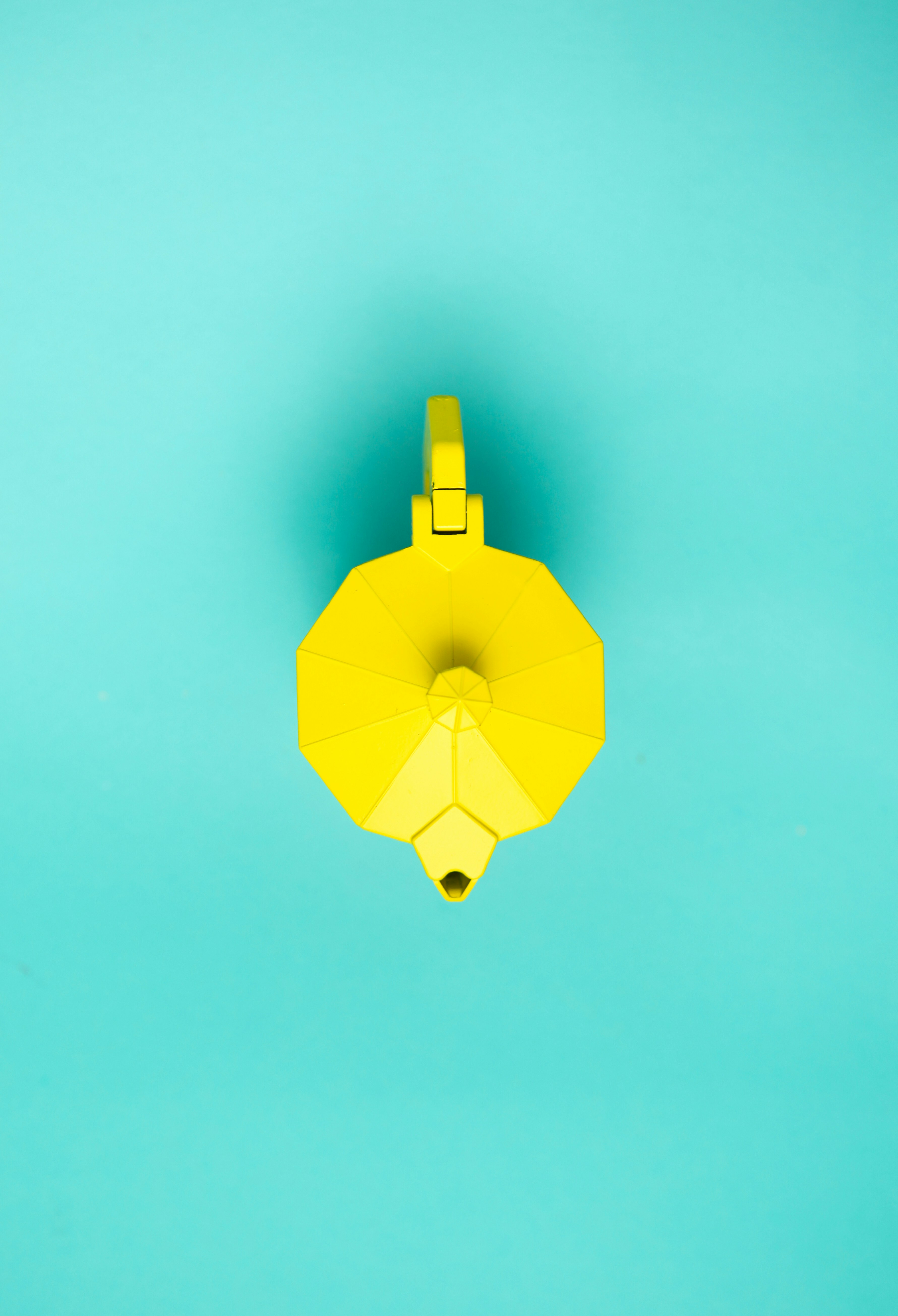
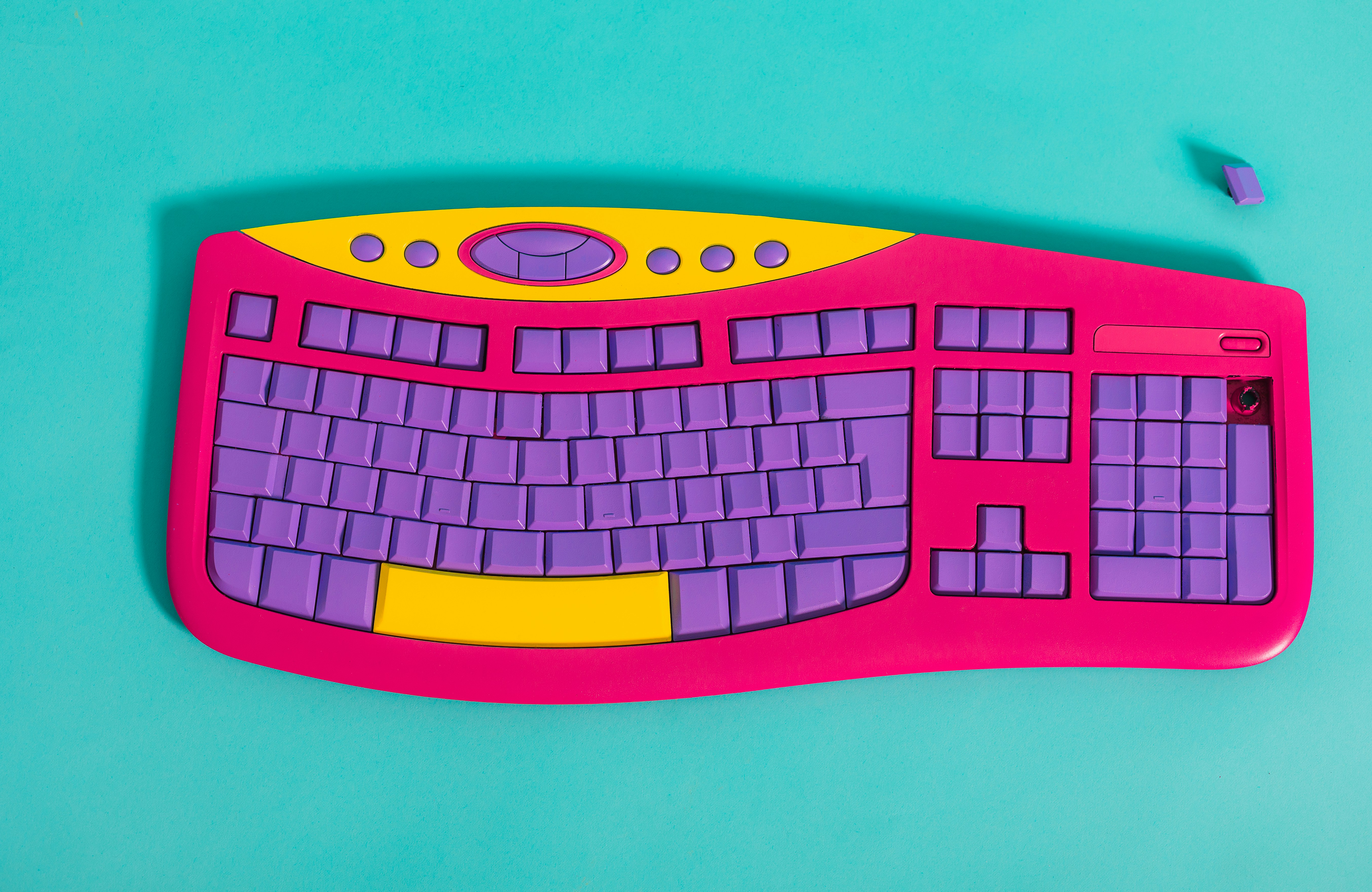


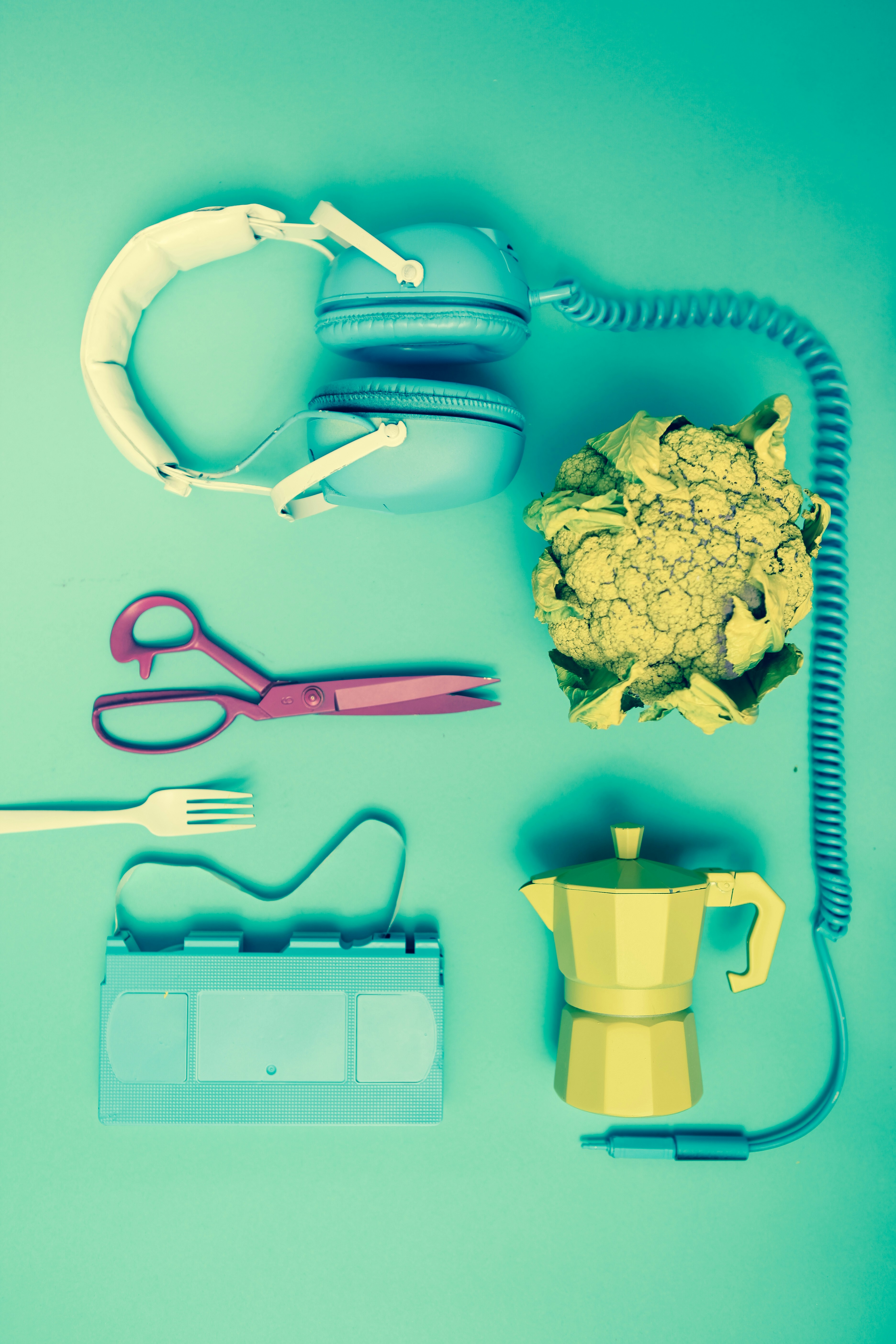
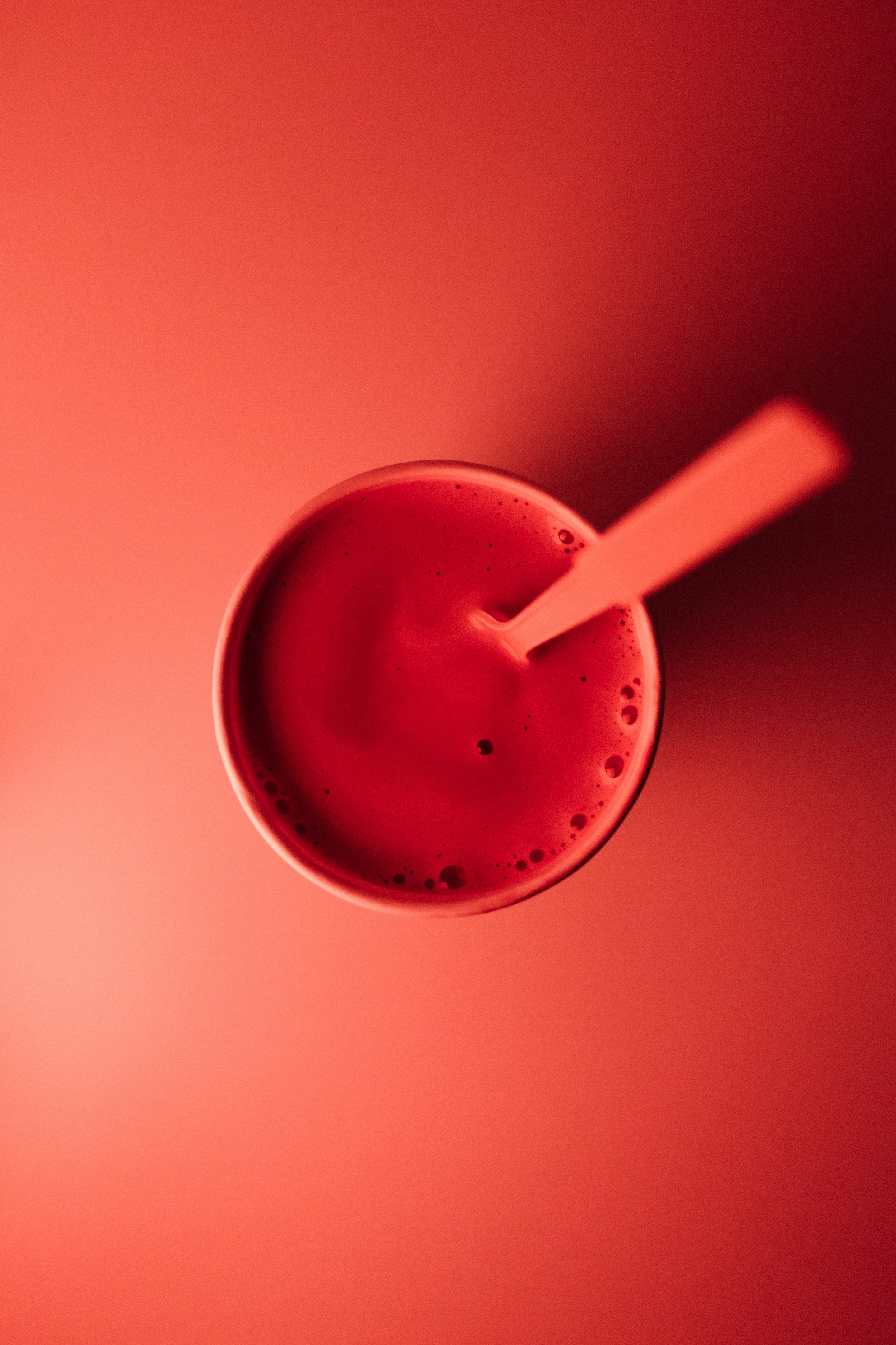
Image from Unsplash.
<div class="elcreative_image image_masonry">
    <div class="image_container">
        <img class="lazyload image_item" loading="lazy" data-src="https://images.unsplash.com/photo-1653287805993-9a1a7ea28c20?w=800" />
        <img class="lazyload image_item" loading="lazy" data-src="https://images.unsplash.com/photo-1557123481-ef06b737a474?w=800" />
        <img class="lazyload image_item" loading="lazy" data-src="https://images.unsplash.com/photo-1653297526910-4834e6763f58?w=800" />
        <img class="lazyload image_item" loading="lazy" data-src="https://images.unsplash.com/photo-1587280717868-fff936890905?w=800" />
        <img class="lazyload image_item" loading="lazy" data-src="https://images.unsplash.com/photo-1546435770-a3e426bf472b?w=800" />
        <img class="lazyload image_item" loading="lazy" data-src="https://images.unsplash.com/photo-1557033051-1d426c3a4d42?w=800" />
        <img class="lazyload image_item" loading="lazy" data-src="https://images.unsplash.com/photo-1558769673-de478227d1f5?w=800" />
        <img class="lazyload image_item" loading="lazy" data-src="https://images.unsplash.com/photo-1503631285924-e1544dce8b28?w=800" />
    </div>
</div>
Pre-Built Components
Pre-Build Components in the SimBox UI theme are HTML components or elements that have been styled using reusable utility class names.
[unavailable yet]Those are some steps to add components or elements manually in SimBox UI Theme. If you have any questions, please write them in the comments section.
Gabung dalam percakapan